
There comes a time, in an exterior designer’s work, when all chickens come home to roost. The client’s needs were heeded, the context was carefully studied, the layout, furniture, and accessories were carefully chosen.
Finally, the project for the high-level garden or luxury outdoor area is ready, only one absolutely crucial phase is missing: the presentation to the client.
It is at this point that the art of rendering comes into play. A well-made, realistic rendering, capable of representing the large-scale garden in detail, is necessary to convey the value and complexity of your design work to the client immediately.
However, that is not enough: the rendering must also be captivating, engaging, and characterized by the right mood. The goal, in fact, is also to convey in advance a part of the grandeur that the end client will experience when the garden is actually built.
To achieve this effect, years of experience are needed both in rendering and in the exterior design sector. You need a certain aesthetic sensitivity, a good degree of creativity, attention to detail, knowledge of the effect of artificial or natural light, as well as the right architectural skills.
The result must be as natural and credible as possible, without an annoying repetition of items in the same position, a very common feature in the renderings of years past.
We wanted to dedicate this post to some tips, useful for making quality renderings. So, the following is a sort landscape architects guide, with the hope that it will help do justice to the work of exterior designers.
Landscape architects guide, the basic rules of rendering
Until a few years ago, the presentation of the projects was based on handmade designs. The project manager then armed himself with a pencil, ink pen, and watercolors to reconstruct the rooms or asked a designer to do it for them. Today, thanks to computers and three-dimensional modeling, it is possible to show clients the exterior of a home in a completely realistic way, as if it were a photo taken with all the work already done.
Every single rendering must be carefully studied to guarantee such perfect results. Among the first aspects that must be evaluated is the shot, the point of view of the scene. The shot best present the most salient features and the project’s most important objects. For example, the most prestigious and representative furnishings should be placed in the foreground.
Textures are another crucial element for obtaining an effect of absolute realism. They must offer a quality that is able to effectively represent the materials chosen for the furnishings. In this sense, it is often necessary to work on various image levels, to give the right sense of shine and transmit surface irregularities.
The rendering must then be enriched with a series of accessories that contribute to the sense of credibility. The designer can insert objects here and there that make one perceive an effective daily use of space: a magazine, a hat, a glass on a coffee table, etc.
In short, the exterior must seem really inhabited. These things, on the other hand, must in no way obscure the importance of the main elements of the image.
Finally, the color balance and the use of the right lights must be regulated. The first is a very relevant aspect to guarantee that the rendering has emotional strength. The lights, on the other hand, serve to create reflections and give depth to the rendering.
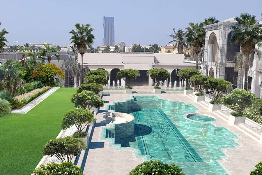
Landscape architects guide: create the scene with OpenStreetMap
Many readers already know this: OpenStreetMap is a mapping of the planet shared under the Open Database License and therefore free for everyone. The maps are made thanks to the free contribution of users who send recorded data from portable GPS devices, cameras, aerial photographs, and other free sources.
Different professional rendering software allow you to import data from OpenStreetMap or other similar sites, to quickly recreate the real environment in which the outdoor furniture will be placed.
On the one hand, this is very useful for obtaining a background that is as faithful as possible to reality, and, on the other hand, it allows you to better understand how the project, once realized, will interact with the surrounding environment.
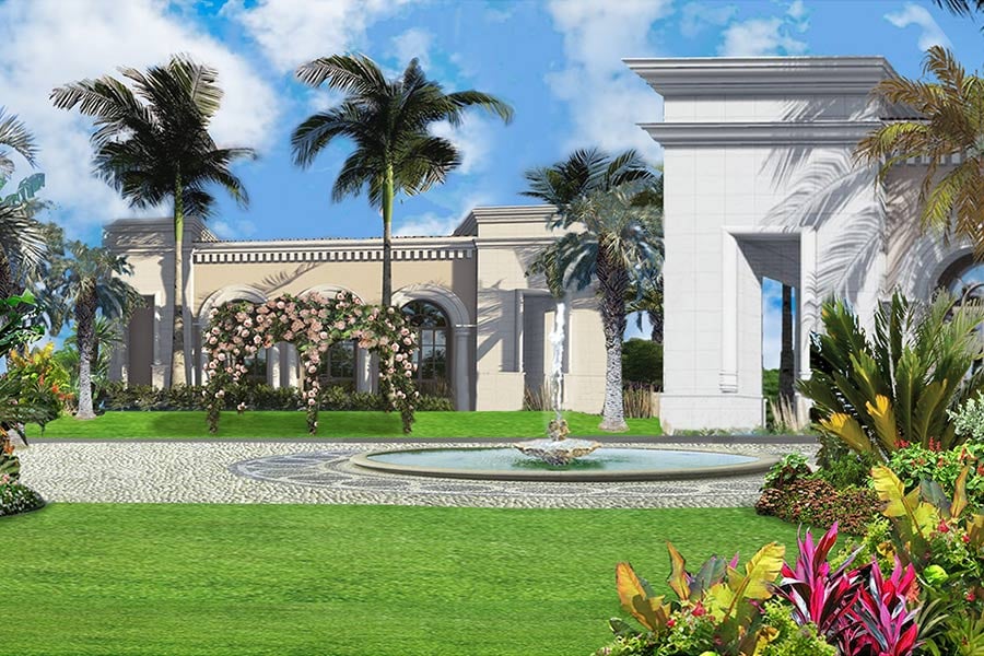
Guide for landscape architects: significant closure
Any exterior project is somewhat defined. By nature, gardens, terraces, and patios have borders that distinguish them as closed environments. In fact, those who live in the home usually seek this "refuge" effect and want to feel somehow embraced by their own corner of paradise.
This sense of pleasant privacy is achieved by paying attention to the height of the objects that act as a fence, such as walls, hedges, trees etc. In principle, within the rendering, it must be at least one third of the length of the horizontal space represented. So, for example, if we are working on a part of the garden that is 9 meters wide, the trees around it should be at least 3 meters high.
Obviously, not all areas of the internal space must necessarily guarantee the sense of protection we are talking about. For example, when we want to give an impression of vastness or we want to guarantee the possibility of enjoying a beautiful view, this rule should not be applied. Closures and openings, therefore, are characteristics that must be modulated according to the feeling you want to give. The important thing is to choose them consciously.
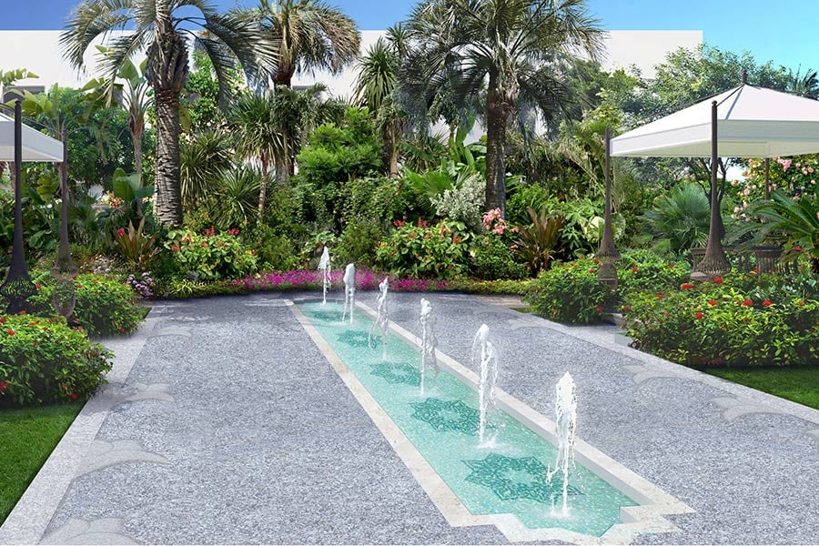
Landscape architects guide: use regulating lines
Le Corbusier explained that the "regulating line" is the anchor that keeps the designer from indulging in their every whim. In a nutshell, the regulating line is an imaginary line that helps you organize objects within the project, generated from architectural elements (walls, edges, buildings ...) or from distinctive elements of the landscape (trees, property borders, roads, etc.).
In a good rendering, positioning the objects along these imaginary lines guarantees an orderly and cohesive result, well integrated with the shapes and proportions of the surrounding context. It also allows you to find a sort of rhythm by choosing the distance between one object and another. In short, it gives the impression that everything makes sense, according to a geometric and coherent pattern.
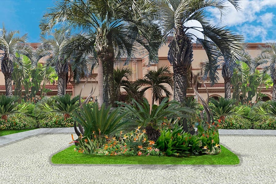
Guide for landscape architects: mass placement
There is particular charm in seeing a large amount of similar objects in the same space. According to the famous landscape designer Russell Page, the most satisfying visual pleasure comes from the repetition of the same element within a view or an image, or from the massing of multiple copies of it in a restricted area.
When preparing a rendering, this effect can be reproduced quickly and easily through special tools made available by the most modern software, in particular the "mass placement" tool. It allows you to quickly add multiple objects of the same type, for example, a group of cars or a row of trees.
In the past, identical objects were added several times with a few clicks, which gave a highly artificial effect. In reality, there are no perfectly equal plants or cars parked exactly in a linear way. Using current software with mass placement, the elements appear to be slightly different from each other, by color, orientation, shape, size, position, distance, etc.
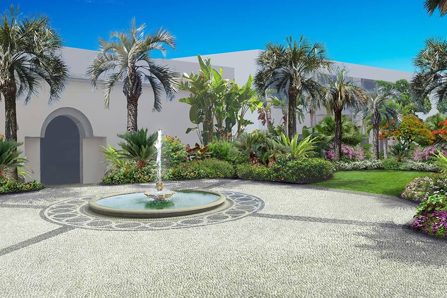
Landscape architects guide: renderings that move
When the external designer shows the rendering to their client, it is a moment of great pathos. The impression that the client will have, in fact, determines the success or otherwise of the entire design. In their eagerness to meet expectations and obtain a positive opinion, the professional focuses entirely on the aesthetic and emotional impact of their simulation.
Adding movement to the image is a very effective way of capturing the interest of the spectator: vehicles and people in animated versions, trees that bend slightly in the wind, the movement of the shot can create the impression of a experiencing a real, habitable environment.
With modern rendering software, you can choose the speed and direction in which any object moves and also adjust how rough or soft the curve must be in a path. The ultimate goal is to harmonize each movement, to create a pleasant and uniform final effect.
3D videos of this type also have a functional purpose: they allow you to better understand how certain objects can interact with the surrounding environment. Think, for example, of the impact that the opening or closing of the shades can have on the space or the effects that the lighting adopted at different times of the day and from various shots can have.

The ultimate meaning of this landscape architects guide
In a market where we have always been confronted with competition and where technological innovation is advancing at a fast speed, presenting our projects in an engaging and captivating way and in step with the times has become an essential requirement. This is why we wanted to offer this short landscape architects guide.
Creating effective contexts through renderings is one of the most important challenges in today's landscape architecture. It is an essential but not simple task that requires long hours of study and processing.
The advice we have given does not claim to be exhaustive or conclusive. These are a few ideas, useful for reflecting on the art of rendering, and we hope they will arouse enough curiosity to stimulate insights.
Learning to make renderings at a professional level is the watershed between two opposite conditions: on the one hand, suffering from the constraint of one's creativity within the limits of a software, on the other hand, mastering a precious tool, which allows you to transmit to others, even deep down, the spirit of one's ideas.
Ruwix is a collection of online puzzle programs and tutorials. Discover the secret of your unsolved Rubix Cube.


